It’s been a few days since I’ve posted on the blog—I’ve been so busy! Along with client work, a few competitions I’m entering, and personal work, I am also taking an online Skillshare class called Digital Illustration: Communicate with Color, Pattern and Texture taught by Brad Woodard. I signed up for it on a whim (and because the price was discounted!) but it has turned out to be an amazing class, and I’ve already learned a tremendous amount! We are now in Unit 3, and the class ends April 1. I thought I would share some of my process work so far.
Sketches
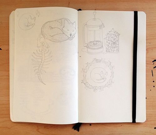
The assignment is to create an illustration based on either the word “loud” or “quiet”. I chose quiet, and here is a sample spread of the sketches I made:
Pen + Ink
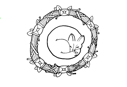
After posting the sketches on Skillshare and getting feedback, the fox in the sticks/leaves wreath was the overall favorite. Although there were a lot of votes for the French Press, so I will probably come back to that sketch as a personal project in the future. I then refined the sketch and inked on paper with pen, using varying line weights.
Color Palette Tests
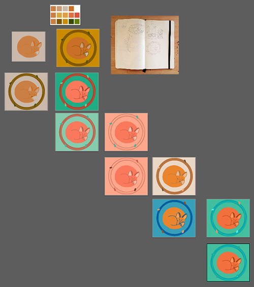
I learned a lot from the class lectures about making color palette choices, including color theory, terms, and different tools to make color palettes. I also learned more about color schemes such as monochromatic, analogous, complementary, triadic, and split complimentary. All very fascinating! I used this new knowledge when creating color palette tests on a quick digital drawing of the illustration. At this point, I’m just focusing on choosing a palette, and not worrying about getting all the details of the illustration correct.
Refined Digital Illustration and Further Color Experimentation
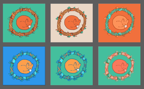
At this stage, I have finalized the illustration composition and line work, and am refining color choices. I still haven’t completely decided on one option, but am leaning towards the first option. I like the idea of the blue outlines in the bottom two, but don’t think it communicates the “quiet” message quite as well—perhaps too much contrast.
Current Piece
So this is where the illustration is currently. Today we have more lectures about pattern and texture, so after that I will be playing around with adding in textures and patterns to the piece. Can’t wait to see how it turns out!